creating spline relativity plots
Jared Fowler
spline_pretty_relativities.RmdTo highlight some more of prettyglm’s functionality we
will now build a logistic regression model with a spline.
Pre-processing
A critical step for this package to work is to set all categorical predictors as factors. Before we fit a spline we will fit the age variable as a categorical variable to understand the trend.
library(dplyr)
library(prettyglm)
data('titanic')

# Easy way to convert multiple columns to a factor.
columns_to_factor <- c('Pclass',
                       'Sex',
                       'Cabin',
                       'Embarked',
                       'Cabintype')
meanage <- base::mean(titanic$Age, na.rm=T)
titanic  <- titanic  %>%
  dplyr::mutate_at(columns_to_factor, list(~factor(.))) %>%
  dplyr::mutate(Age = base::ifelse(is.na(Age)==T,meanage,Age)) %>%
  dplyr::mutate(Age_Cat = prettyglm::cut3(Age, levels.mean = TRUE, g =10)) %>%
  dplyr::mutate(Fare_Cat = prettyglm::cut3(Fare, levels.mean = TRUE, g =10))

# Build a basic glm
survival_model <- stats::glm(Survived ~ Pclass +
                                        Sex +
                                        Sex:Fare_Cat +
                                        Age_Cat +
                                        Embarked +
                                        SibSp +
                                        Parch,
                             data = titanic,
                             family = binomial(link = 'logit'))
Understanding the trend
By setting plot_factor_as_numeric equal to TRUE in
pretty_relativities() we can plot understand the bucketed
categorical predictors trend. Setting
plot_factor_as_numeric equal to TRUE also works for
interactions like Sex:Fare.
We will fit a knot point at 18 and 35.
pretty_relativities(feature_to_plot= 'Age_Cat',
                    model_object = survival_model,
                    relativity_label = 'Liklihood of Survival',
                    plot_factor_as_numeric = T
                    )
We will fit a knot point at 55.
pretty_relativities(feature_to_plot= 'Sex:Fare_Cat',
                    model_object = survival_model,
                    relativity_label = 'Liklihood of Survival',
                    plot_factor_as_numeric = T,
                    iteractionplottype = 'colour',
                    facetorcolourby = 'Sex')
Creating the spline
prettyglm includes some useful functions to assist in
building splines. splineit() takes the minimum and maximum
points of a spline to create the splined column. An example workflow
using dplyr is shown below.
titanic  <- titanic  %>%
  dplyr::mutate(Age_0_18 = prettyglm::splineit(Age,0,18),
                Age_18_35 = prettyglm::splineit(Age,18,35),
                Age_35_120 = prettyglm::splineit(Age,35,120)) %>%
  dplyr::mutate(Fare_0_55 = prettyglm::splineit(Fare,0,55),
                Fare_55_600 = prettyglm::splineit(Fare,55,600))

survival_model4 <- stats::glm(Survived ~ Pclass +
                                         Sex:Fare_0_55 +
                                         Sex:Fare_55_600 +
                                         Age_0_18 +
                                         Age_18_35 +
                                         Age_35_120 +
                                         Embarked +
                                         SibSp +
                                         Parch,
                              data = titanic,
                              family = binomial(link = 'logit'))
Visualising the spline
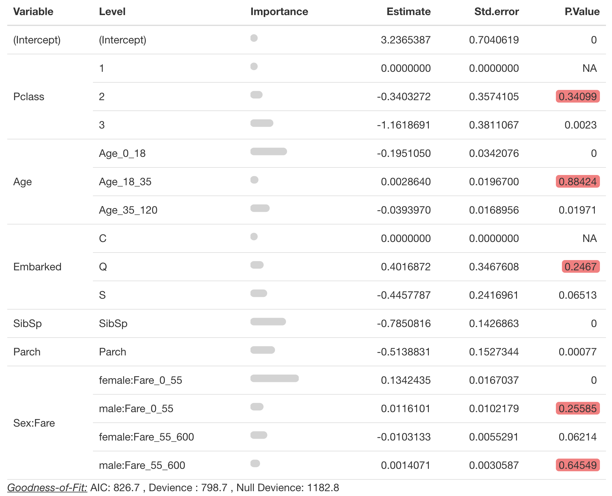
Creating a table of model coefficients
For interactions variables are grouped on the left pane under
Variables. It is important to provide the correct
spline_seperator
pretty_coefficients(survival_model4,
                    significance_level = 0.1,
                    spline_seperator = '_')
Create plots of fitted coefficients using pretty_relativities
Single Variable Splines
You also need to provide a spline_seperator input in
pretty_relativities().
pretty_relativities(feature_to_plot= 'Age',
                    model_object = survival_model4,
                    relativity_label = 'Liklihood of Survival',
                    spline_seperator = '_'
                    )
Interacted Splines
By default pretty_relativities() will colour by the
factor variable.
pretty_relativities(feature_to_plot= 'Sex:Fare',
                    model_object = survival_model4,
                    relativity_label = 'Liklihood of Survival',
                    spline_seperator = '_',
                    upper_percentile_to_cut = 0.03
                    )
If you prefer to facet by the factor variable, change
iteractionplottype to “facet”
pretty_relativities(feature_to_plot= 'Sex:Fare',
                    model_object = survival_model4,
                    relativity_label = 'Liklihood of Survival',
                    spline_seperator = '_',
                    upper_percentile_to_cut = 0.03,
                    iteractionplottype = 'facet'
                    )